

A content marketing dashboard is the single view that tells you which content to update, promote, or retire so editorial work produces measurable outcomes. It must enable one repeatable decision every month: where to spend the next round of content hours. Everything else, from metric choice to tool selection, exists to serve that one job.
Table of Contents
- What Is a Content Marketing Dashboard, and What Should It Do?
- Who Actually Uses These Dashboards, and What Do They Need?
- Which Dashboard Views Should You Build First?
- Metrics to Track: 8 to 12 KPIs Organized by Funnel Stage
- How to Build a Content Marketing Dashboard, Step by Step
- Minimum Viable Dashboard: A Copy-Ready Template
- Common Mistakes That Kill Dashboard Adoption
- The Monthly Review That Turns Data Into Action
- Expert Perspective: How Executive Edge Measures Content Authority
- Customizing Dashboards for Your Organization
- Protecting Sensitive Data Inside Your Dashboard
- Tools for Building a Content Marketing Dashboard
- Training Your Team to Actually Use the Dashboard
- Build In-House or Bring in a Managed Partner?
- Primary Sources and Further Reading
- Sources
- FAQ
What Is a Content Marketing Dashboard, and What Should It Do?
A content marketing dashboard pulls performance data from your content assets into one place so you can decide what to fix, fund, or cut. That is different from a general marketing dashboard, which typically blends paid media spend, brand awareness scores, and campaign timelines into one crowded view. A content dashboard has a narrower job: track the lifecycle of published content and connect it to business results.
Most teams build the wrong version first. They pull every metric Google Analytics 4 (GA4) offers, dump it onto one screen, and call it done. The result looks impressive in a demo and gets ignored within three weeks, because nobody built it around a decision. The Content Marketing Institute points out that dashboards fail when they try to answer every question for every person at once. A dashboard that serves the CMO, the SEO manager, and the freelance writer simultaneously usually serves none of them well.
Outcome-first design flips the build order. Instead of starting with "what data do we have," you start with "what decision does this role need to make monthly, and what's the smallest set of numbers that supports it." A content manager deciding which blog posts to refresh needs organic click trends and Search Console gaps. A CMO deciding whether to expand the content budget needs pipeline influence and cost per lead. Those are different dashboards, even if they draw from the same underlying data.
This distinction matters because a "content marketing dashboard" isn't officially standardized terminology the way "content analytics" or "marketing attribution" are in the analytics field. Treat it as shorthand for a role-based content performance reporting system, built from the same content analytics principles marketers already use in GA4, Search Console, and CRM reporting.
Who Actually Uses These Dashboards, and What Do They Need?
Four roles touch a content dashboard regularly, and each one asks a different question when they open it.
- CMO or VP of Marketing: Is content producing revenue-worthy pipeline influence, and where's the risk? They scan ROI, assisted conversions, and any sudden drop in organic traffic that signals a Google update or technical issue.
- Content manager: What needs attention this week? They live in the refresh queue, checking which pages are losing rankings or converting below benchmark.
- SEO manager or specialist: Which URLs have high impressions but low click-through rate? That gap, visible only at the page level in Search Console, is where quick wins hide.
- Analyst: Is the data trustworthy? They check for tracking gaps, UTM inconsistencies, and whether GA4 events are firing correctly before anyone else trusts a number.
Building four separate views instead of one master view sounds like more work upfront. In practice it is less work over time, because each view answers a real question instead of forcing every user to filter through fields they never touch. The Content Marketing Institute's warning about "Frankenstein" dashboards, stitched together from every stakeholder's wish list, applies directly here: role-based design is what keeps a content strategy dashboard usable past the first month.
Which Dashboard Views Should You Build First?
Start with four views. Expand only when a specific, recurring question outgrows what those four can answer.
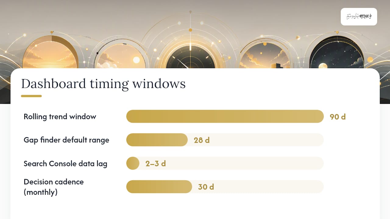
- Content health overview. A rolling 90-day trend of organic sessions and impressions, segmented by content type or category. This is the "is anything broken" view, checked in under two minutes.
- Search Console gap finder. A table sorted by impressions with click-through rate as a visible column, filtered to show pages with high impressions and low CTR. This is where title tag and meta description fixes live.
- Conversions by landing page. Every content URL mapped to its conversion count and rate, pulling from GA4 goals or events. This tells you which posts are working commercially, not just traffically.
- Refresh queue. A running list of URLs flagged for update, each with an owner, a due date, and a one-line reason. Without this, the other three views are just interesting charts nobody acts on.
A minimum viable content analytics dashboard built on these four views covers the monthly decisions most teams actually make, according to guidance from Click Laboratory.
Add specialist views once the MVP is running smoothly and a specific gap keeps recurring. An SEO deep-dive view, tracking keyword position changes and backlink acquisition, makes sense once you're actively running a link-building or technical SEO initiative. A social and distribution view, showing which platforms drive the most qualified traffic back to owned content, earns its place once you're testing paid amplification or influencer partnerships. An ROI and pipeline view, tying content touches to closed revenue in the CRM, belongs at the executive level once sales and marketing agree on an attribution model.
Name each view by the decision it supports, not by the data source. "Refresh Priorities" beats "GA4 Export." Filter defaults should match the most common query. For the gap finder, that means sorting by impressions descending and defaulting to the last 28 days, since Search Console data lags by two to three days. Refresh cadence should match review cadence: daily data feeding a monthly decision creates false urgency and burns attention on noise.
Metrics to Track: 8 to 12 KPIs Organized by Funnel Stage
Pick 8 to 12 metrics total, organized across four funnel stages, rather than tracking everything GA4 and your CRM can technically report. Sona's guidance on content marketing metrics dashboards recommends this range specifically because it's enough to see the full funnel without drowning the team in numbers nobody checks.
Pro Tip: Label every metric widget with its formula, source, and refresh cadence directly on the dashboard. It sounds like extra design work, but it's the fastest way to kill the "wait, where did this number come from" conversation that derails every review meeting.
Reach metrics measure whether people can find the content at all.
- Impressions (source: Search Console): how often a URL appeared in search results. Watch for seasonal swings that mimic a real drop.
- Organic sessions (source: GA4): actual visits from unpaid search. This is the metric most teams over-index on alone.
- Click-through rate (source: Search Console, calculated as clicks divided by impressions): low CTR with high impressions usually means a weak title or meta description, not a ranking problem.
Engagement metrics measure whether the content, once found, actually holds attention.
- Engagement rate (source: GA4): the percentage of sessions lasting longer than 10 seconds, with a conversion event, or with two or more page views.
- Average engagement time (source: GA4): useful for comparing similar content types against each other, less useful compared across formats.
- Scroll depth (source: GA4 custom event or a tool like Hotjar): reveals whether readers reach your calls to action or bail at paragraph three.
Conversion metrics measure whether engagement turns into a business action.
- Content conversion rate (source: GA4 goals, calculated as conversions divided by sessions): the core commercial health check for any page.
- Leads generated from content (source: CRM, filtered by first-touch or last-touch content URL): raw volume, useful alongside rate.
- Assisted conversions (source: GA4 multi-channel funnels): credits content that supported a sale without being the final touchpoint, which matters for long B2B cycles.
Revenue metrics close the loop between content and dollars.
- Content-influenced pipeline (source: CRM, requires UTM or content-touch tagging): total deal value where content appeared anywhere in the buyer's journey.
- Content-sourced revenue (source: CRM): revenue from deals where content was the first touch.
- Content marketing ROI, calculated as (revenue attributed to content minus content cost) divided by content cost, multiplied by 100. IVRistech's guide to proving content marketing ROI stresses that the attribution model you choose changes this number substantially, so document which model you're using right next to the figure.
Every metric needs an owner and a pitfall note. Impressions can spike from a Google algorithm test with no real ranking change. Engagement rate can look artificially high on thin content if GA4's event thresholds are misconfigured. Assisted conversions undercount when sales reps forget to log the source. None of that makes the metrics useless. It makes labeling their limitations non-negotiable.
How to Build a Content Marketing Dashboard, Step by Step
Building a working dashboard is a sequencing problem more than a technical one. Get the order wrong and you end up with a beautiful chart nobody trusts.
-
Define the decisions first, using user stories. Write each one as "I need [metric or view] so that I can [decision]." Example: "I need URL-level CTR data so that I can prioritize which title tags to rewrite this month." The Content Marketing Institute recommends this user-story approach specifically to stop dashboards from becoming data dumps.
-
Map each decision to one or two metrics, no more. If a decision needs five metrics to make sense, the decision is probably too vague. Break it down further.
-
Choose data sources based on where the metric actually lives. GA4 handles traffic and on-site behavior. Search Console handles search visibility and CTR. Your CRM, whether HubSpot or Salesforce, handles the revenue side. Resist the urge to recreate CRM data inside GA4 through custom events. It's fragile and duplicates work.
-
Pick an integration method that matches your team's technical capacity. A BI connector like Looker Studio's native GA4 and Search Console integrations works for most teams and updates automatically. A nightly CSV export into a spreadsheet works fine for smaller teams or a first pass, though someone has to remember to run it. A Notion or Airtable base with manual weekly entry is the slowest option but the easiest to stand up in a single afternoon with zero engineering support.
-
Design the visualization around a single glance. Put the outcome metric, whatever answers "are we winning," at the top. Put channel and content-type breakdowns in the middle. Put page-level detail and the refresh queue at the bottom for anyone who wants to drill in. This top-to-bottom hierarchy is a pattern SuperX's guide to content performance dashboards describes well, and it's the layout most Looker Studio templates default to for good reason.
-
Annotate for data lag before anyone asks why the numbers look wrong. Search Console data trails by two to three days. GA4 event data can take up to 24 hours to fully populate in standard reports. A small note on the dashboard header, "Search Console data reflects activity through [date]," prevents a dozen Slack messages every review cycle.
-
Validate the numbers against a second source before launch. Cross-check GA4 session counts against Search Console click counts for the same date range. They won't match exactly, GA4 and Search Console measure differently, but wildly divergent numbers usually mean a tracking setup error, not a data quirk.
-
Assign an owner to the dashboard itself, not just to the metrics inside it. Someone needs to be responsible for checking that the connectors are still running, that filters haven't broken, and that new content gets tagged consistently. Without an owner, dashboards quietly go stale within two review cycles.
Minimum Viable Dashboard: A Copy-Ready Template
The fastest path to a working content analytics dashboard is copying a known-good structure rather than designing from a blank canvas. Click Laboratory's four-view MVP framework maps directly onto the monthly decisions most teams need to make, and it fits inside a single Looker Studio report or a two-tab spreadsheet.
Each widget needs a specific data shape to be useful, not just decorative:
- The content health widget needs a 90-day line chart of organic sessions, plus a comparison line for the prior 90-day period, so a decline actually stands out against seasonality.
- The Search Console gap finder needs a table with columns for URL, impressions, clicks, CTR, and average position, sorted by impressions descending and filtered to CTR below your site average.
- The conversions by landing page widget needs URL, sessions, conversions, and conversion rate, ideally with a filter to isolate blog or resource content from product pages.
- The refresh queue needs URL, flag reason, owner, due date, and status, structured as a simple table rather than a chart, since it's a to-do list first and a report second.
For teams building in Looker Studio, GA4 and Search Console both offer native connectors, which means the health overview and gap finder can update automatically without manual exports. Teams without BI tooling can replicate the same structure in Notion or Airtable, with the refresh queue as a proper database view (filterable by owner and status) and the other three widgets as embedded charts pulled from a weekly CSV export.
| Widget | Primary Metric | Source | Refresh Cadence |
|---|---|---|---|
| Content health overview | Organic sessions, 90-day trend | GA4 | Weekly |
| Search Console gap finder | Impressions and CTR by URL | Search Console | Weekly |
| Conversions by landing page | Conversion rate by URL | GA4 | Weekly |
| Refresh queue | Status and owner | Manual entry | Continuous |
Label each widget with its source and a one-line caveat, directly on the dashboard. That small habit is what Sona's dashboard best practices point to as the difference between a dashboard people trust and one they quietly stop opening.
Common Mistakes That Kill Dashboard Adoption
Most abandoned dashboards die from the same handful of preventable errors.
- Building one dashboard for everyone. A CMO-level view crammed with page-level detail overwhelms executives; a role-based approach, as the Content Marketing Institute recommends, fixes this at the design stage rather than the review stage.
- Tracking vanity metrics with no decision attached. Total pageviews, total social shares, and total content pieces published all feel productive to report and drive zero action on their own. If a metric doesn't change what you'd do next month, cut it.
- Skipping source validation before launch. A dashboard built on incorrect GA4 events or misconfigured UTM parameters can mislead. Always cross-check key metrics against a second source to ensure data reliability.
- Adding metrics faster than you retire them. Dashboards tend to grow, never shrink, unless someone actively prunes them. Before adding a new metric, ask what old one it's replacing.
- Leaving the refresh queue empty of owners. A flagged page with no assigned person attached rarely gets fixed. The queue is the action engine of the whole system, not a passive list.
Keep the metric count fixed at whatever range you land on inside that 8 to 12 window, and treat every new addition as a trade, not an add-on.
The Monthly Review That Turns Data Into Action
A dashboard with no meeting attached is just a report nobody discusses. Click Laboratory's recommended cadence is a 60-minute monthly review built around five steps.
- Data quality check (5 minutes). Confirm the connectors are running, the numbers look plausible, and nothing broke since last month.
- Refresh queue review (15 minutes). Walk through flagged pages, confirm owners, and close out anything already fixed.
- Search Console gap review (15 minutes). Identify new high-impression, low-CTR pages and assign title or meta rewrites.
- Pipeline signal check (15 minutes). Review content-influenced pipeline and flag any content type or topic driving unusually strong or weak results.
- Action log (10 minutes). Write down every decision made in the meeting with a name and a date attached, then close the meeting.
Between monthly reviews, content managers should run a five-minute weekly check on three things only: any page with a sudden traffic drop, any newly published piece's early performance, and whether the refresh queue has any overdue items. Quarterly, zoom out to strategic KPIs, content marketing ROI trend, pipeline influence by content category, and whether the metric set itself still matches the decisions the team is actually making. Metrics that stopped driving action get cut at this checkpoint.
Expert Perspective: How Executive Edge Measures Content Authority
Tracking content performance for a single blog is one problem. Tracking it across podcast episodes, YouTube videos, blog articles, and short-form social content simultaneously, for a client who never has to touch a spreadsheet, is a different scale of problem entirely. That's the environment David Domm and the Executive Edge Authority Engine team work in daily, and it shapes a specific view on what actually matters in a dashboard.
A done-for-you authority program can't rely on vanity metrics, because the client isn't paying to feel busy. They're paying for visibility, trust, and influence that shows up in search results, in AI-driven answer engines, and eventually in their pipeline. That means weekly tracking of amplification signals, how content performs across search and AI discovery platforms, alongside monthly rollups tied to the same reach, engagement, conversion, and revenue framework covered above. The dashboard isn't the product. It's the proof the strategy is working.
For business owners in Tyler and East Texas, we often see this exact gap: strong expertise, consistent local reputation, and almost no visibility data connecting the two. A dashboard built around decisions, not data volume, closes that gap faster than adding more content ever will on its own.
— David Domm
Customizing Dashboards for Your Organization
Off-the-shelf templates get you started, but the metrics that matter for a solo consultant look nothing like the metrics that matter for a 50-person B2B marketing team, and a dashboard that doesn't account for that gap gets ignored fast.
Customization should follow organizational structure, not personal preference. A single-location service business needs local search visibility and lead-form conversions front and center; a multi-brand enterprise needs the ability to filter every view by brand or business unit without duplicating the whole dashboard four times. Build filter dimensions in from the start, category, author, content type, business unit, rather than retrofitting them later, since retrofitting usually means rebuilding.
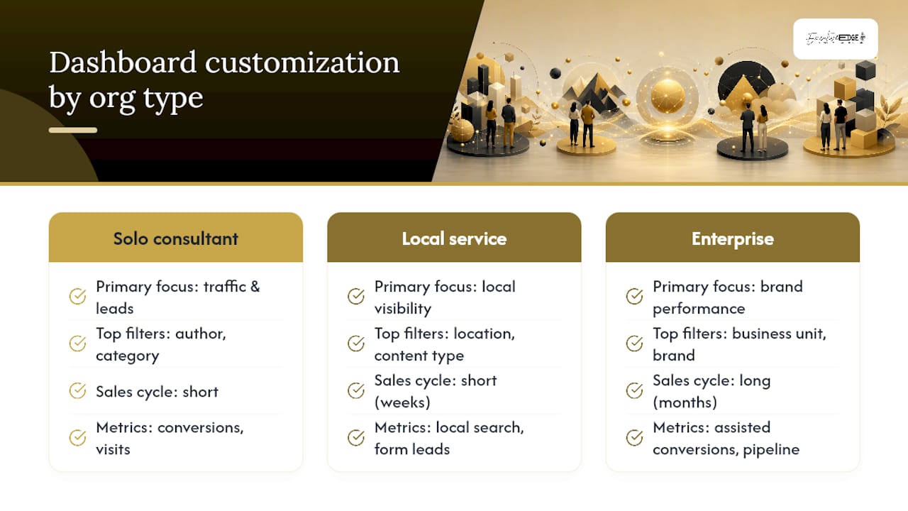
Sales cycle length matters too. A company with a two-week sales cycle can reasonably track content-to-close in the same monthly review. A company with a nine-month enterprise sales cycle needs to lean harder on assisted conversions and pipeline influence, because waiting for closed revenue to judge content performance means waiting nine months to learn anything.
Let each role customize their own view's filters and date ranges without permission to alter the underlying metric definitions. That balance, personal flexibility within a shared definition, keeps the numbers comparable across the team while still letting a content manager and a CMO look at the same data through different lenses. Revisit the customization itself once a quarter. If a filter or dimension hasn't been used in three months, it's clutter.
Protecting Sensitive Data Inside Your Dashboard
Revenue figures, CRM data, and customer-level detail flowing into a content dashboard turn it into something that needs the same access discipline as your CRM itself, not a casual internal tool anyone can view.
Set access by role, not by convenience. A freelance writer reviewing content performance for their own assigned pages doesn't need visibility into company-wide revenue attribution or individual sales rep performance. Most BI tools, including Looker Studio, support view-level and filter-level permissions, so a single underlying dataset can power multiple access tiers without duplicating the build.
Strip personally identifiable information before it reaches any content-focused view. Aggregate lead counts and conversion rates tell you what you need to know for content decisions; individual names, emails, and phone numbers belong in the CRM proper, accessible only to the people who need them for follow-up.
Audit access quarterly, especially for contractors and agency partners who rotate on and off projects. A former freelancer with a live Looker Studio link months after their contract ended is a common, avoidable gap. Revoke dashboard access as part of offboarding, the same way you'd revoke a shared drive or a Slack channel.
If your dashboard connects to a CRM through an API key or service account, store those credentials the way you'd store any other sensitive integration key, in a password manager or secrets vault, never in a shared spreadsheet cell or a Slack message.
Tools for Building a Content Marketing Dashboard
The right tool depends less on features and more on who's maintaining the dashboard after launch.
Looker Studio is the most common starting point for teams with GA4 and Search Console as primary sources, largely because Google's own connectors make setup fast and the cost is free. It's strong for automated visual reporting but weaker for teams that need heavy manual data entry, like a refresh queue with detailed notes.
Notion or Airtable work well as a lightweight starting point, especially for the refresh queue component, since both handle database-style views (filtered, sorted, grouped by owner) more naturally than a chart-first BI tool. The tradeoff is manual data entry for anything not already in a spreadsheet-friendly format.
Enterprise BI platforms built for cross-department reporting make sense once a content dashboard needs to sit inside a broader marketing operations stack alongside paid media and product analytics. That level of investment usually isn't justified until the content program itself has scaled well past the MVP stage.
For most teams starting fresh, the honest advice is to build the four-view MVP in whichever tool your team already uses daily. A dashboard in a tool nobody opens is worse than a simpler one inside the platform your team checks every morning anyway.
Training Your Team to Actually Use the Dashboard
A dashboard nobody knows how to read is functionally the same as no dashboard at all. Training solves a different problem than building, and skipping it is why some well-designed dashboards still get ignored.
Start training with the decision, not the data. Walk each role through the specific question their view answers before explaining what any individual metric means. A content manager who understands "this view tells me what to fix this week" will find their way around the interface faster than one handed a glossary of metric definitions first.
Run the first live review meeting as a working session, not a presentation. Let people ask "why does this number look like that" in real time, and use those questions to catch labeling gaps or confusing filters before they become a pattern of quiet distrust.
Document metric definitions and formulas in a single shared reference, linked directly from the dashboard, so new team members can self-serve instead of interrupting someone else's afternoon. Revisit that documentation whenever a metric definition changes, since a silently redefined metric is one of the fastest ways to make a whole team stop trusting a dashboard's history.
Build In-House or Bring in a Managed Partner?
DIY makes sense when someone on your team already owns analytics as part of their role, your content volume is modest, and you have the internal bandwidth to run a monthly review consistently. It stops making sense once content spans multiple formats, podcast, video, blog, and social, and no one person has time to both produce the content and maintain the measurement system behind it.
A managed partner changes what gets tracked, not just who tracks it. Instead of internal team output alone, the priority shifts to amplification reach, search and AI-platform visibility, and how consistently authority-building content ties back to business inquiries. A managed partner approach handles both the production and the tracking side of that equation, which is exactly the gap that causes most in-house content programs to stall once volume outpaces the team's reporting capacity.
Primary Sources and Further Reading
For hands-on setup detail beyond this guide, Google's own GA4 documentation and Search Console Help Center remain the most reliable references for event configuration and query-level reporting. Click Laboratory's four-view MVP framework is worth reading in full for its decision-mapping approach. Sona's metrics dashboard guide covers the 8 to 12 KPI framework in more depth, and the Content Marketing Institute's piece on analytics oversights is the sharpest breakdown available of why dashboards fail after launch rather than at launch.
Sources
Five systems feed most content dashboards, and each one has a practical setup pattern worth knowing before you connect anything.
GA4 handles traffic, behavior, and on-site conversion events. Set up custom events for the specific actions that matter, like form submits or resource downloads, rather than relying on default pageview data alone.
Google Search Console handles organic visibility: impressions, clicks, CTR, and average position at the URL level. This is the only reliable source for CTR data, since GA4 doesn't capture pre-click search behavior.
Your CRM, whether HubSpot or Salesforce, handles the revenue side: leads, pipeline stage, and closed deals tied back to content touchpoints through UTM parameters or a content-attribution field.
Email platforms contribute open rates and click-throughs on content-driven campaigns, useful for measuring distribution performance separate from organic discovery.
Native social analytics, pulled directly from each platform rather than a third-party aggregator, show which channels actually drive qualified traffic back to owned content.
For integration method, Click Laboratory recommends starting with GA4 and Search Console alone, since those two cover reach and engagement without requiring any CRM cleanup work. Add CRM and pipeline data once basic tracking is reliable and sales has agreed on how content touches get logged. A direct BI connector is the cleanest long-term option; a nightly CSV export is a reasonable stopgap; a manual spreadsheet plus a Notion or Airtable front end works for teams testing the concept before committing budget to tooling. For a fuller revenue picture, especially in businesses closing deals over the phone, offline conversion tracking setups fill a gap that GA4 alone can't cover. Whatever you choose, annotate lag: Search Console trails by two to three days, and GA4 event data can take up to a day to fully populate.
- Content Analytics Dashboard: Build One Marketers Use | Click Laboratory
- These 4 Analytics Oversights Mess With Your Content Performance Plan | Content Marketing Institute
- What Is a Content Marketing Metrics Dashboard? Definition and Best Practices — Sona
- Content Marketing Metrics Dashboard: Prove Real ROI (2026)
FAQ
What Is a Good Dashboard for Content Creators?
A good dashboard for an individual creator tracks organic sessions, engagement rate, and conversions by piece of content, kept to a handful of metrics so it takes under five minutes to review weekly.
What Should Be in a Marketing Dashboard?
A content-focused marketing dashboard should include reach metrics (impressions, sessions, CTR), engagement metrics (engagement rate, time on page), conversion metrics (conversion rate, leads), and revenue metrics (pipeline influence, ROI), organized by role rather than crammed into one view.
What Are the Three C's of Content Marketing?
Definitions vary across sources, but a common version refers to Content, Context, and Conversion, meaning the material itself, the audience situation it's delivered into, and the action it's meant to drive.
What Are the Four Types of Dashboards?
In content marketing reporting, the four practical types are content health overview, SEO gap finder, conversion tracking, and ROI or pipeline influence, each built for a different role's monthly decision.
How Many Metrics Should a Content Dashboard Track?
Keep it to 8 to 12 decision-driving metrics spread across the reach, engagement, conversion, and revenue funnel stages, rather than tracking every available data point.
How Often Should You Review a Content Marketing Dashboard?
Run a full 60-minute review monthly, a quick 5-minute check weekly for urgent issues, and a broader strategic review quarterly to confirm the metric set still matches current goals.